Showing posts with label picture color. Show all posts

Tuesday, June 28, 2011

The color of happy


The color of Happy -
Yellow... definately. 
Picture color and the 30 Day Challenge are nearing the end.  Its made June a wonderful and busy photography month for me.  Its made me stretch and its made me better. 
Am I "there" yet?
Nope
But, I'm a little bit closer :)

Wednesday, June 22, 2011

more color, more challenges

 Day 22 of 30 Day Challenge - Hands
Ever really thought about how expressive hands can be? 

 Day 21 of 30 Day Challenge - Faceless Self Portrait

 Picture color - Corrugated Color
Texture and color and how shadows can play such a part in the interestingness of color.
This is a detail on our fireplace - a fluted travertine edging.

Picture Color - Inspired By
This was hard for me.  There are so many photographers that inspire me.  This was taken with Justine Gordon in mind.  She takes such beautiful simple shots that always have the most incredible lighting.  Lately I have been really inspired by the beautiful photography of Sigi Kolbe.  I have a long way to go. I have many wonderful teachers I have found on Flickr.  If in the end I become a mere fraction of the photographer that some of these people are - I will be happy.
Well really, I am happy and amazed at how far I have come in a year's time.

Monday, June 20, 2011

A little catching up to do

Some catching up to do.  First, 30 Day Challenge 17-20
bokeh, something orange, shoes and technology.


Bokeh
I have a "Bling Fling" to attend tomorrow.  So, I have been gathering Bling.  Now I just need to decide if the tiera is too over the top. 

Something Orange
 Orange is good.  One of my favorite colors.  I always tell people that there really isn't a happier color than orange.  Once again, I can't really wear it - but I love it anyway.

Shoes

Its officially summer tomorrow.  I've worn my sandals a couple of times but ended up with popcicle toes.  Hasn't really been warm enough - but I am ready.

Technology

iPod, iPhone - love it... Technology.  Think of all the technology that has come about in our lifetime - now think of it in terms of your parents or grandparents.  It is really pretty amazing when you put it into perspective.

Picture Color - 17-19
Haven't done today's yet.  Still working on it

Seeking Sun

Looking for sunflares and how the sun changes colors when photos are taken right into the sun.  It was a amazing sunrise Friday. 

 Picture Calm

Blue is calm - candles are calm.  Its a nice way to wind down at the end of the day.

 Personal Color

Berry Sorbet was my color last year.  I haven't really found the signature color for this year yet. 

Thursday, June 16, 2011

Something Blue


Long Exposure for the 30 Day Challenge. 
I read about it.  I spent a lot of time yesterday trying to get it to work for me.  I ended up with a lot of crap.  So, when all things go wrong... go back to basics.  Here is my best attempt at long exposure - for today anyway.


Picture Color - Something Blue
What can I say?

Tuesday, June 14, 2011

Color Statement

Color Statement

Today's color prompt sent me wandering through the house.  I was observing what color or colors I use as my statement - my style.  Its funny that I really do find red everywhere in my house. 
I don't think of it as my favorite color at all.  I would definately classify turquoise, yellow green and orange in that category. Being a blonde, I don't wear red.  I'm drawn to it in clothes, but I never buy them because red just over powers me - or at least I think so. 
Yet, red is everywhere in my house. 
Ever thought about what color is your color statement/style?


Speaking of style - eyes is the prompt for the 30 day challenge.  Linking up with Caroline over at Nowordz.com for the month of June.
Yesterday was me with 13 things -


Monday, June 13, 2011

Color Catch Up

Weekends are fam time round here.  So, that means photo antics take a back seat.  Today is Color Catch Up day:
11, 12 and 13


Day 11 of Picture Color - The Best of Both Worlds
 Ever noticed how there are colors that seem an odd pairing?  Like red and pink for example.  One makes a bold statement and the other is the calmer version.  These colors live with us everyday, playing off one another.  


Day 12 - Seeing Spots
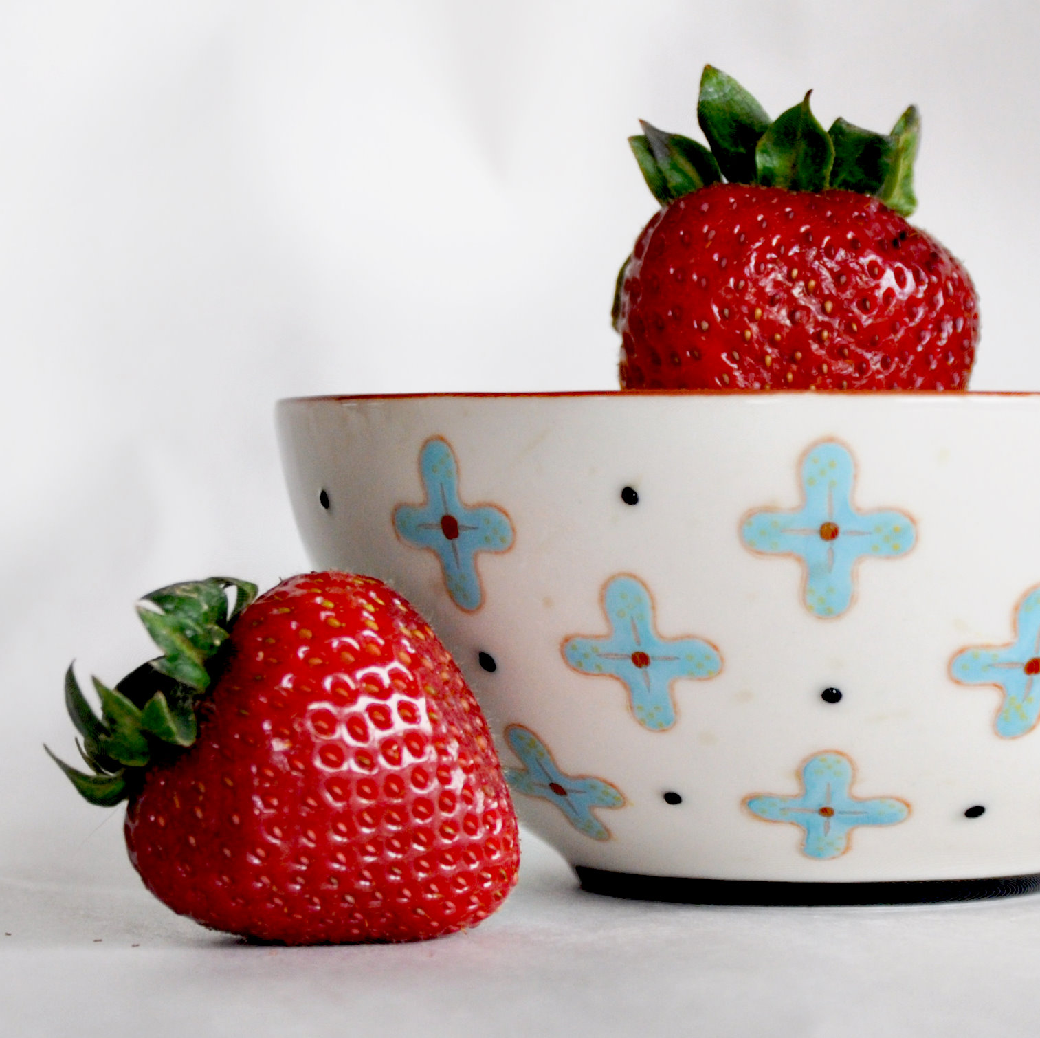
Polka dots are such happy spots of color.  They can be tone on tone for sophisticated tastes or bold and beautiful for a more playful spin. 


Day 13 - Celebrating Ordinary Color
Its easy to take things for granted.  To just roll through the day without really taking notice.  Today try observing the ordinary color in your life.  What colorful items do you see daily that maybe you have overlooked?  Take notice and celebrate these little color smiles that brighten your every day. 

I will be guest posting over on Kat Sloma's blog Kat Eye View of the World.  Kat is moving back to the US after living in Italy.  She asked me to write a post about repartirating after living overseas.  Will let ya know when.

Thursday, June 9, 2011

Color - Punctuation and Texture

More color for Picture Color series.  Keeping me busy for the month of June. 


The Texture of Color

This morning I was wondering what I would find for texture in color.  I had an early Dr. appointment - time for the annual sweep from top to bottom.  No coffee, no food - total brain fog.  Stopped at Starbucks on the way home and a little shopping therapy to get me back on track for the day. 
Got home and still had no happy ideas for texture. There, on the patio table my little sedums were basking in the sunny goodness bathing their little leaves. Don't you love it when something just leaps out at you and begs to be noticed?


Punctuation Mark

I had all kinds of ideas for this prompt, but they weren't ones that I could pull together.  Finding that one thing that makes the color punctuation mark was harder than I thought. I wanted it to have punch but not be hokey.  Not sure I really pulled this off, so its making me want to really look for something that fits the bill.  Something that is a found thing versus a put together thing - know what I mean?
I will definitely revisit this one in the future.

Tuesday, June 7, 2011

Color Me Yummy!

More color inspiration for the month of June. 
Color Me YummY

I was in Anthropologie the other day.  I go there to get creative inspiration.  There is something about the vibe in that place that really resonates with me. 
I couldn't help but to feel this time I needed to bring home a treat.  This great little tea cup was my treasure for the day.


Over at Mortal Muses they are focusing on square format.  I cropped this one square to see what I thought.  I actually had a hard time picking which I preferred. I was having a hard time sticking to the rule of thirds with the first one, but I liked seeing the whole cup versus not.
What do you think?

Monday, June 6, 2011

More on Color

More with Tracy Clark's Picture Color.  These are prompts 4,5, and 6. 

 Finding TECHNICOLOR. 
Had bought these fancy paperclips on a trip to the office supply store.  I really don't know why I bought them.  Paper clips really aren't part of my life.  However, for some reason the happy colors and shapes caught my eye and I had to bring them home. 

 The color of COMFORT.
I find comfort in tea - especially green tea.  Now don't get me wrong, I am a coffee girl through and through.  I can't start my day without my morning cuppa. 
However, a cup of tea really soothes the soul.  The color, the fragrance and the taste combine and make my mind chill.  Comfort in a cup.  I love it.

White on White
This was a little harder than I anticipated.  I actually had a hard time finding something was white and photo worthy.  Took a few trys to get it right. 
Whenever I go to the beach, I can't help myself but to pick up little treasures.  I come home with sand in my pockets and little momentos of an afternoon walking the tide line.  When I was a kid we spent hours on the beach.  Our entire summers were spent by the seaside.  I keep some of my favorite shells on display in a little jar on my shelf.

Friday, June 3, 2011

Picture Color 2&3


Picture iconic color. 
What are colors that when we see them, they stir up memories or brands associated with that particular color?  There are two here - eraser pink and school pencil yellow.  Remember how cool it was to have new pencils?  And.. how in no time the eraser was worn flat, the pencil grew shorter and shorter with each crank of the pencil sharpener.  Then we added those cone-head shaped things that fit over the top of the pencil?  See how colors can be iconic? 


Color can be so much more than just one color.  Mother Nature wields her colorful brush and blends her colors so richly.  One color gracefully combines with another dancing across flowers and leaves, the sky and the water.  It is really amazing when you look closely at how really there are so many colors that combine to make up the one color that registers in our mind - like red for example.

Slow down today, just for a moment and take in the color.

Wednesday, June 1, 2011

Picture Color - Day One

I've decided I need some inspiration in my photography.  I signed up to take Tracy Clark's Picture Color class for the month of June. 


Today is about BLISS - picture the color of BLISS
I had to really think about what this means to me.  What color is BLISS? 


I decided turquoise or aqua is it for me.  It makes me think of the sea.  The seaside is near and dear to me and will always hold a special place in my heart.


Today is pouring rain.  However, the way the raindrops danced on the outdoor glass table seemed like such a nice way to capture the color of BLISS.
 
Related Posts Plugin for WordPress, Blogger...